Papercut has a great and easy to use web interface to printing, however it isn't mobile responsive. This post will make the papercut web interface mostly mobile responsive and I say mostly because there is some tweaking that can be done to make the web version better then what I have below. This will give you a good start. This is for a specific use case, in this case the organization is only concerned with printing, and does not archive or want the user to have access to the recent print jobs or summary.
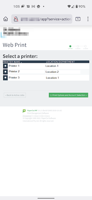
Papercut's User Web Print interface is typically like this.

What the CSS changes I have put down below will change the look from that to this.

Here is the CSS to make papercut user web print mostly web responsive.
The key is adding "@media (pointer:none), (pointer:coarse) {" to the user-refresh.css located typically in the $Drive\Program Files\PaperCut MF\server\webapp-52403\css\user-refresh.css
The following css will give you a good start on making the papercut web client much more accessible to the user.
@media (pointer:none), (pointer:coarse) {
#main{
margin-left:0px !important;
}
#header{
height:150px !important;
}
#header-logo{
height: 150px !important;
}
#header-logo img{
height: 150px !important;
}
#container:before{
display:none !important;
width:0px !important;
}
h1{
font-size: 48pt !important;
}
h2{
font-size:42pt !important;
}
.filter{
display: none !important;
}
.web-print-intro #web-print-intro-msg{
font-size: 36pt !important;
}
a.btn{
font-size:36pt !important;
margin-left:auto;
margin-right:auto;
padding:36px;
}
table.results th {
height: auto;
text-align: left;
height: 0;
padding: 8px 1rem;
text-transform: uppercase;
letter-spacing: .05em;
color: rgba(255, 255, 255, 0.7);
background: #293e50;
font-size: 14pt;
line-height: 1;
font-weight: normal;
white-space: nowrap !important;
margin:0px;
padding: 0px;
}
table.results th, table.results td{
font-size: 21pt !important;
margin:0px;
padding:0px;
}
input[type=checkbox], input[type=radio]{
background-color: #293e50 !important;
margin:4px;
padding:16px;
}
label{
overflow: hidden;
white-space: nowrap;
text-indent: -15px;
width:400px;
}
.wizard-heading{
font-size: 24pt;
}
.no-web-print-jobs{
font-size:18pt;
}
.wizard{
font-size:14pt;
}
.buttons{
font-size:24pt;
padding:12px;
margin-left:auto;
}
.wizard div.buttons input{
font-size:18pt !important;
padding:16px !important;
}
.form{
font-size:18pt !important;
padding:16px !important;
}
.form input{
font-size:18pt !important;
padding:16px !important;
}
td.fields{
font-size:18pt !important;
padding:16px !important;
}
.dropzone-div{
font-size:18pt !important;
padding:16px !important;
}
#dropzone-table{
font-size:18pt !important;
padding:16px !important;
}
#file-format-details{
font-size:12pt !important;
}
#dropzone-button{
font-size:18pt !important;
padding:16px !important;
}
#upload-from.dz-clickable{
font-size:16pt !important;
padding:16px !important;
}
th.desc{
padding:0px !important;
}
.dz-filename{
font-size:16pt !important;
}
.dz-size{
font-size:16pt !important;
}
.dropzone .dz-preview .dz-details img, .dropzone-previews .dz-preview .dz-details img{
width:200px !important;
height: 200px !important;
}
td{
font-size:16pt !important;
}
.smallText, .help-block {
font-size: 18pt !important;
color: #8e959e !important;
margin: 0 !important;
}
#footer{
position: absolute !important;
}
}
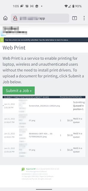
Here are some screenshots with the end result.


